Tati's Critique of Modern Architecture
by Alex Moore, June 13, 2017
Walk through a city’s central business district almost anywhere in the world and you’re going to see the same thing. You’ll walk into stores and see variants of the same products. You’ll walk around town and see variants of the same fast food chains. Look down the street and you’ll see variants of the same cars filled with people headed to the same jobs. It doesn’t matter if you’re in Tokyo, Manhattan, Dubai, or Panama City. These centers of the global economy feel more similar than not. Over the past few decades globalization has created a new, global culture, which for better or worse, has eroded local mores. The most clearly visible manifestation of this trend might be architecture. Those glassy towers with their austere exteriors and Barcelona chairs in the lobby are the same in every city. Anywhere in the world, I can find the same building full of the same furniture with the same companies inhabiting them and selling the same products.
Jacques Tati made Mon Oncle in 1958, when France was transforming its economy from a regional, European one into a global one. France was in the midst of what has been dubbed Les Trente Glorieuses [The Glorious Thirty]. These three decades from 1945 to 1975 saw France, along with the rest of Western Europe, regain the prosperity that had been lost during two world wars. The era was characterized by rapid economic growth enabled by internationalization and increased productivity. Wealth lost during the wars was regained. Individuals’ spending power increased allowing them to splurge on a range of household goods. In practice, this meant that the lifestyles of people living in advanced economies like Western Europe, North America, and Japan began to converge. Everyone wanted a car, a washing machine, a television, and a lawn.
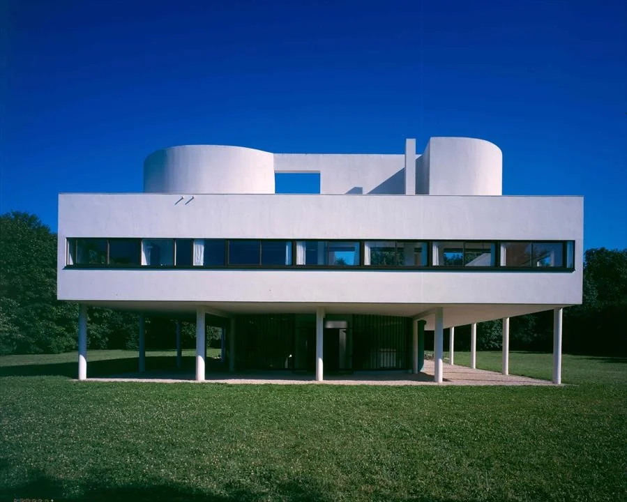
This additional wealth came with the slick aesthetics of modernism which took off in the immediate aftermath of WWI and continued into the post-WWII era. This wide-ranging trend encompassed everything from the visual arts to music to industrial design to architecture. In the context of architecture, it implied a focus on simple, rational forms which avoided ornamentation and historical context. In France, this movement was exemplified by Le Corbusier who is famed for proclaiming that “a house is a machine for living in.”
Le Corbusier’s famed Villa Savoye eschews historical references and ornamentation in favor of clean, geometric lines
In Germany and later the US, Walter Gropius and the Bauhaus school focused on the standardization of rationally planned buildings. Ultimately, with the help of architects like Mies van der Rohe [known for his ‘less is more’ philosophy], this led to those glassy skyscrapers that festoon every major city in the world. It was in this era that those gleaming cityscapes of concrete and glass began, and, with a few exceptions, its continued ever since.
While many people were celebrating the increased prosperity, Tati had reservations. He saw the new global culture chipping away at traditional France and taking the joie de vivre and common sense with it. While this change was taking place in a variety of domains at the time, Tati focused on its most conspicuous manifestations: architecture and design.
Tati saw the rationality and lack of historical context of modern architecture as discouraging the enjoyment of life. He found modern life, with all its accoutrements, dull, overly self-serious, and lacking in common sense. The first hint we get of Tati’s attitude comes from his use of music in Mon Oncle. As Mr. Hulot wanders through his own neighborhood with its winding streets bursting with life, we’re treated to a cheerful, relaxed soundtrack. On the other hand, once we move to more modern settings like the Villa Arpel or the plastic company, the music disappears to be replaced by the clicking and clacking and beeping and buzzing of technology. In a not too subtle piece of sound-design, Tati is telling us that human life is full of music until we hand it over to the rationality of modernity.
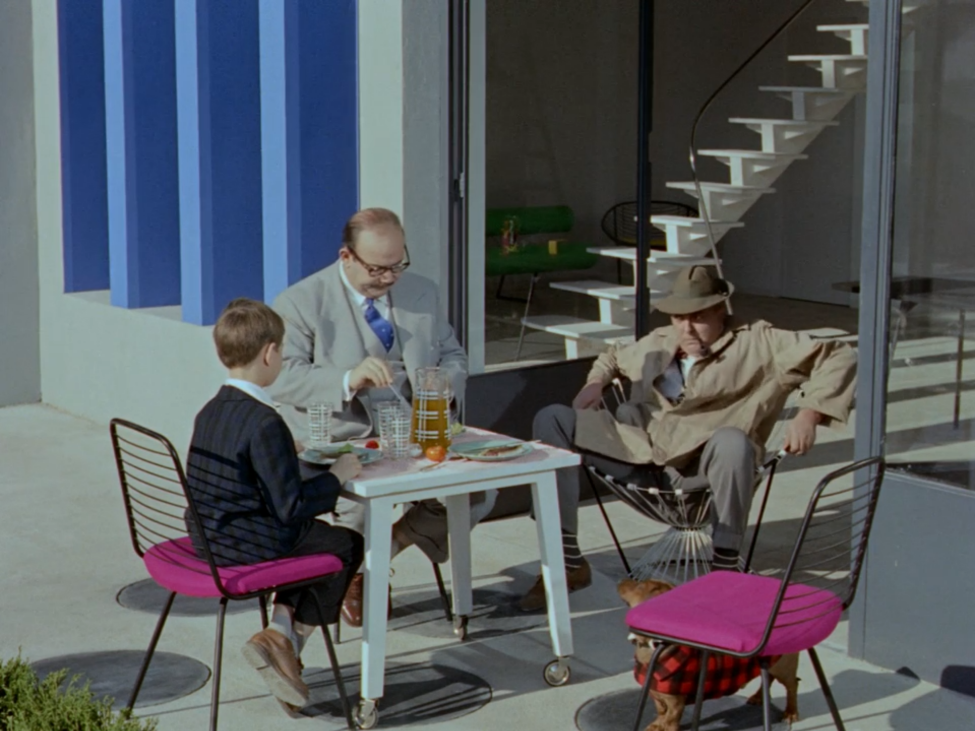
This distinction in soundscape is the backdrop to a series of gags designed to reveal the absurdity embedded in modern life. These jokes reveal a world where the modern obsession with technology, planning, and geometric rationality override commonsense. In fact, Villa Arpel, the home featured in Mon Oncle, with its modernist furniture, hi-tech appliances, and austere design serves as a laboratory for exposing the absurdity of modernity. Consider the amount of time Tati spends depicting people walking around the Villa Arpel’s garden. With its square beds of colored gravel and tidy grass, the garden reveals how a designer thinks a rational garden ought to look. Unfortunately, the designer hasn’t put much thought into how the garden will be used leading to a series of comic moments. During the dinner party sequence, for example, people are repeatedly shown following or passing by each other awkwardly because they don’t want to step off pavers into the gravel or grass below. Mr. Hulot is constantly seen hopping over a gap in the pavers instead of following the inconvenient but [supposedly] aesthetically pleasing swoop in the path. Why make a path that’s inconvenient for the sake of aesthetics? Why have a garden at all if you can’t even step on most of it? Tati sees modern sensibilities as misunderstanding the essence of the things it touches. In this case, he portrays a garden which, absurdly enough, has been designed to prevent people from using it like a garden.
What about Mr. Hulot’s interaction with the bizarre array of chairs in the house? While everyone else manages to maintain a shred of dignity while sitting in the famed Acapulco chairs, Mr. Hulot looks like he’s fallen into a bucket. While everyone else adjusts their sitting style to accommodate the chair, Mr. Hulot tries to sit in it as he would a normal chair. Again, Tati shows us a chair that is designed to function as a statement rather than a chair. In the film, only Mr. Hulot seems to notice.
Mr. Hulot fails at Acapulco chair
In fact, this gap between Mr. Hulot and the other adults in the film, serves as a central theme in the film. As we see various people interact with modern environments, it’s only Mr. Hulot and the children that are baffled or amused by how little sense they make. The rest of the adults willfully ignore the inconvenience imposed on them by modern design. The Arpels fail, for example, to see how their technologically advanced sensor actuated automatic garage door opener leads to far more inconvenience than the old manual one. They don’t realize how the gizmos and gadgets in the kitchen are an impediment to cooking. These appliances, it seems, have been designed to showcase technology rather than improve life.
All of these elements and many more are combined in Villa Arpel to showcase the modern lifestyle that Tati is critiquing. The people who live in houses like these, according to Tati are not only willfully ignoring inconvenience, but not living life at all. In fact, Tati goes as far as to say that “geometrical lines do not produce likeable people.” He brings this claim to life by contrasting the people outside the walls of Villa Arpel with those within. The people outside are chaotic, boisterous, messy, and generally fun-loving. The people within, on the other hand, are obsessed with work and status.
Of course, not all hope is lost for the inhabitants of modern architecture. Instead Tati believes that we need to pay more attention to promoting life and living in the moment rather than planning and living for the future. He wants us to take life a little less seriously just like Mr. Hulot and the inhabitants of old Paris do. Towards the end of his career, in an interview, Tati said “I am not at all against modern architecture, but I believe it should come with not only a building but also a living permit.” As we rush around our gleaming modern cities, that’s a piece of advice that more people ought to hear.


